Wise Owl Paint’s Color Selection Guide
I have received many requests for advice on which colors to select so I put together this post featuring all of our colors. Included is some suggestions for pairings and finishes. Each color includes a description of the shades to help you make the best choice on colors and finishes. I hope you find this visual color selection guide helpful.
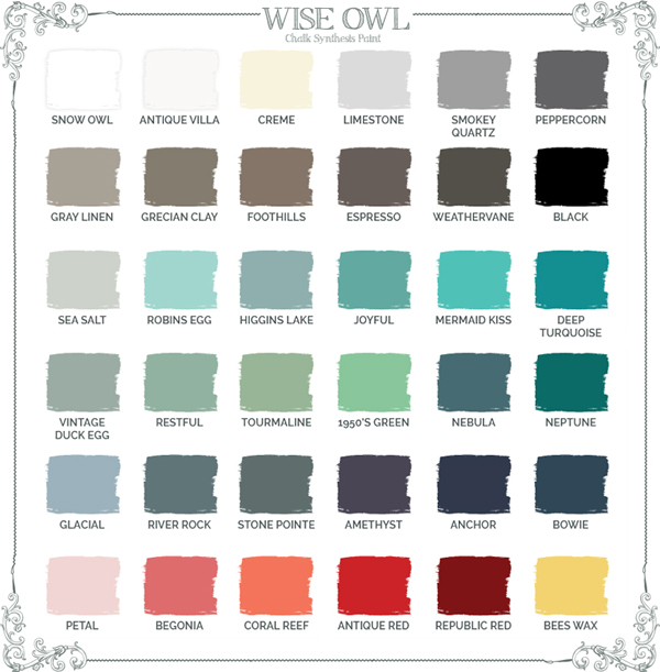
[twocol_one]
Bright white that is white, extra white, with a side of white! If white is not a color but a lifestyle for you, this is your shade! Use clear wax to preserve the stark white quality to this clean crisp white.
[/twocol_one]
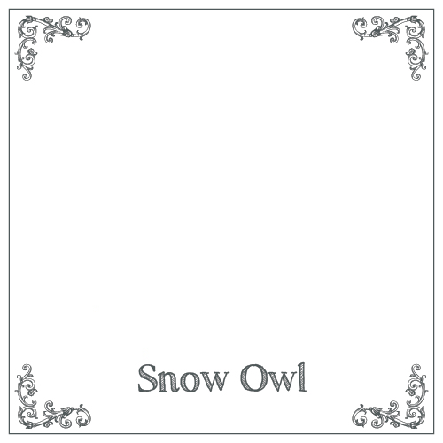
[twocol_one_last]
The perfect off-white, not too stark, not too creamy. This shade has just enough warmth to feel inviting while still remaining bright.
[/twocol_one_last]
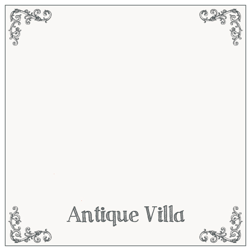
[twocol_one]
The quintessential French crème, a succulent heavy cream shade with warmth that is not perceived as yellow but a rich shabby white.
[/twocol_one]
[twocol_one_last]

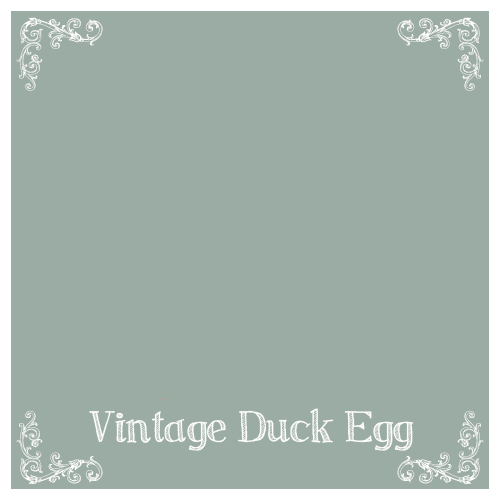
A whisper of Gray that is on the white spectrum with a hint of cool gray. Vintage Duck Egg is my personal favorite to pair with Limestone. Driftwood wax is a beautiful finish that adds subtle dimension to this shade.
[/twocol_one_last]
[twocol_one]
Perfectly balanced true gray. Just enough cool and warmth to be situated in the middle of the gray spectrum. Accent with peppercorn for a 2 toned beauty but also coordinates with any shade because of its versatility. Try Black Hemp oil wax paired with it for added dimension.
[/twocol_one]
[twocol_one_last]
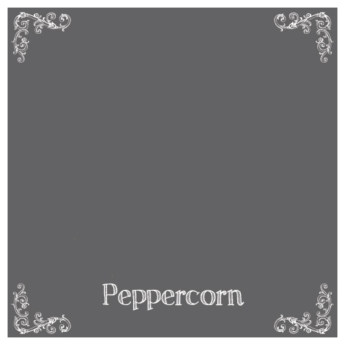
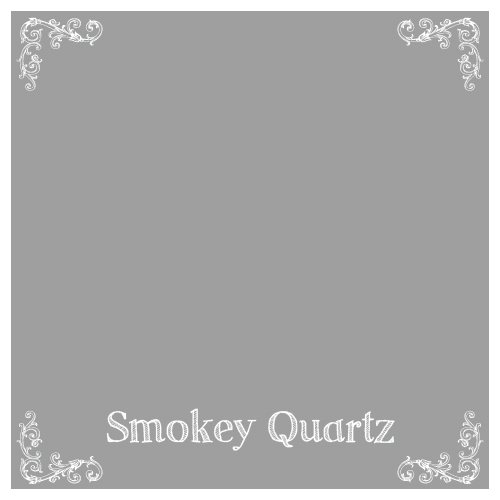
Almost a graphite, this rich gray is a beautiful yet dramatic choice for cabinets and more. Deep cool gray that is a favorite paired with Higgins Lake, Joyful, and complimented perfectly by our Black Walnut Glaze.
[/twocol_one_last]
[twocol_one]
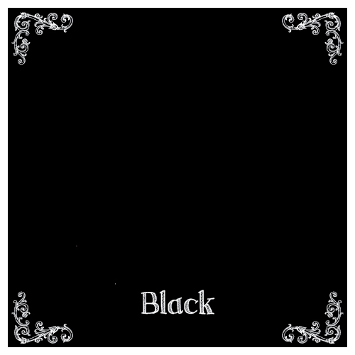
True and deep, this jet black is perfectly complimented by pearl wax for a luminous washed black, or white wax for a dramatic vintage chalkboard feel. Black or clear wax can also be used to preserved this pigment drenched black.
[/twocol_one]
[twocol_one_last]
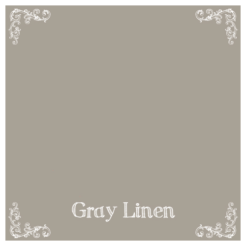
The most versatile of all shades, a greige with equal parts gray and beige to create a tone that lends itself to cool and warm accents equally. Use umber wax to warm up this color or black wax to create a vintage patina.
[/twocol_one_last]
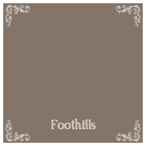
[twocol_one]

The more dramatic counterpart to Gray Linen, a richer shade of greige that is reminiscent of homemade hot cocoa with enough gray to reserve its place as a versatile neutral. Glazed in Black walnut glaze or waxed in black hemp oil wax, this neutral will reveal unexpected richness.
[/twocol_one]
[twocol_one_last]
Cocoa meets milk chocolate in a luxurious medium brown. Shades of taupe make this warm neutral a gorgeous compliment to most colors.
[/twocol_one_last]
[twocol_one]

Dark Chocolate warmth with a walnut tone envelops this rich brown.
[/twocol_one]
[twocol_one_last]
A rich bronze that is a wonderful combo of cool dramatic gray and dark chocolate brown. A unique shade that is beautiful paired with Vintage Duck Egg, Gray Linen, and more.
[/twocol_one_last]
[twocol_one]
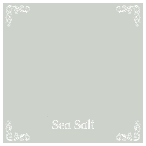
Beachy salty air inspired this shade of lovely. Gray, Blue, Green, and White all combine to produce a color that seems to change throughout the day depending on the suns influence. Pair with Smokey Quartz, Peppercorn, Limestone, Gray Linen, or Snow owl. Pearl wax or Pearl glaze can be used to add luminescence without being over the top.
[/twocol_one]
[twocol_one_last]
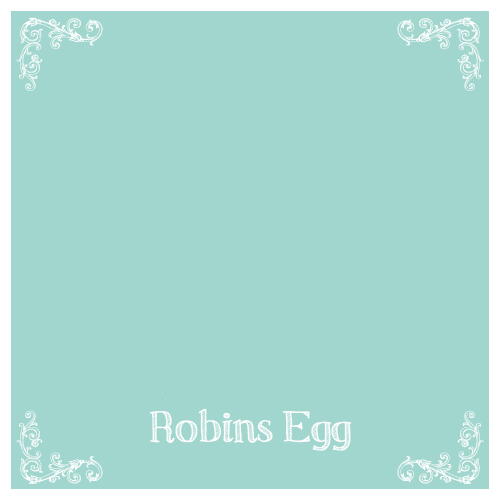
A pale blue with brightness like a Robin’s Egg in spring. Complimented by whites, Begonia, Coral Reef, Limestone, and Gray Linen. Driftwood wax is a finish that adds a subtle dimension.
[/twocol_one_last]
[twocol_one]
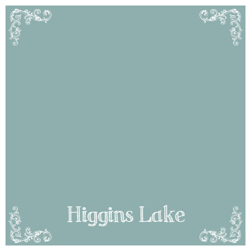
One of the most loved and best-selling colors in the Wise Owl Palette. A truly versatile blue that has a slight turquoise cast while remaining an approachable and very complimentary color to most every shade. Pairs with all neutrals and Driftwood Glaze has quickly become a favorite finish. It’s safe to say that Higgins Lake plays nicely with all colors. Inspired by Its namesake, a clear and almost Caribbean looking lake in Michigan.
[/twocol_one]
[twocol_one_last]
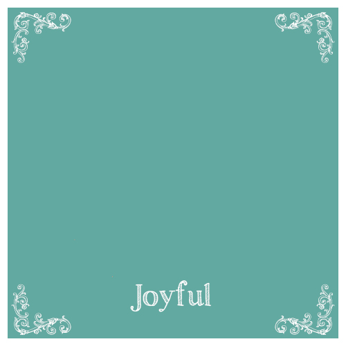
The Perfect turquoise! Just enough green to showcase shades of blue with a slight gray cast to make this an accessible pop of color without being over the top. Black Walnut Glaze and Joyful were meant for each other where vintage patina is desired. It’s no secret that this is my personal favorite and it remains our best-selling color next to Vintage Duck Egg. It is a versatile color that can be paired with every one of our finishes beautifully.
[/twocol_one_last]
[twocol_one]
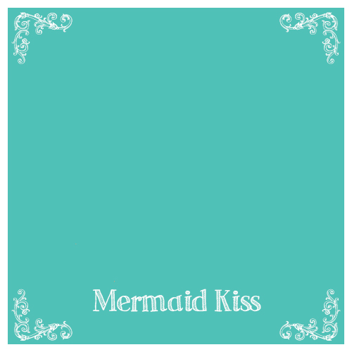
Paint is therapy and this gorgeous turquoise is your happy place! Bright, fun, electric, and versatile. Tone down with black walnut glaze for a vintage patina or use white wash glaze to soften this shade. Umber wax can be used to create a union of opposites attract. Peppercorn and Coral Reef are two personal favorites to pair with Mermaid Kiss. This is a bright, energetic pop of color this is simple stunning paired with so many colors. Try it with antique Red for a surprising harmony.
[/twocol_one]
[twocol_one_last]
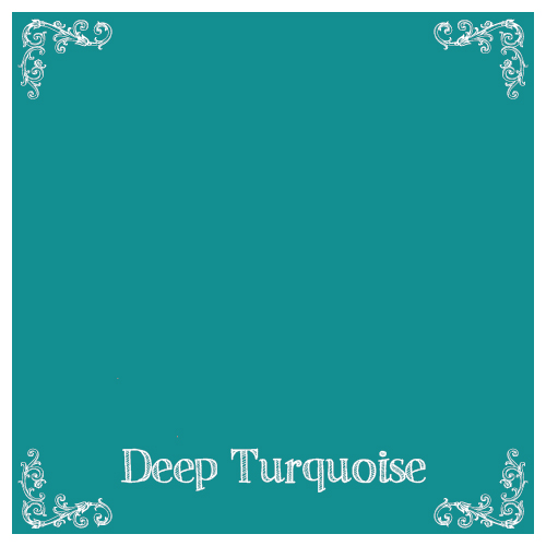
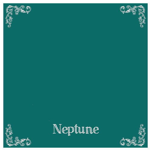
A medium-dark rich turquoise that is a welcome shade of drama and fun. Pair with Peppercorn, Smokey Quartz, Whites, Coral Reef, Neptune, and more. Black or Black Walnut Glaze are finishes that create depth when used with this color. The Shades of Blue Moon Wax pairs metallic turquoise wax and opalescent pearl wax in 1 product, creating a finish with unique subtle sparkle and white washed dimension.
[/twocol_one_last]
[twocol_one]
Green blue and gray meet, creating a shade reminiscent of lichen growing on a tree. A beautiful pop of color that is almost on the neutral scale because of the natural shade. An elemental soft green gray often found in nature that is pure perfection paired with all neutrals.
[/twocol_one]
[twocol_one_last]
A tranquil green with plenty of blue and a touch of gray. A soothing shade of turquoise that is on the greener side of the color scale. Gray linen, Grecian Clay, Peppercorn and Foothills are some of the neutrals that compliment this color. Black glaze and Umber Hemp Oil wax are great to create a vintage patina and create dimension.
[/twocol_one_last]
[twocol_one]

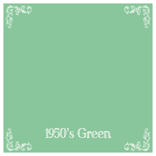
A medium vintage natural shabby chic green that is simply lovely. A muted green compared to our brighter 1950’s green. Black Walnut or Black Glaze is a beautiful compliment but Tourmaline remains a receptive color to all of our finishing products. Crème and Tourmaline pair together to create nostalgia and paired with petal you may be reminded of spring peonies.
[/twocol_one]
[twocol_one_last]
A fun and flirty garden green. This color can remain more modern if finished with clear wax or it can be the perfect shabby chic green finished with Black Walnut Glaze or Black Hemp Oil Wax. Pair with petal for whimsical charm or Coral Reef for tropical and bright attention grabbing color. Limestone is also a wonderful compliment to this green inspired by a gardens new spring growth.
[/twocol_one_last]
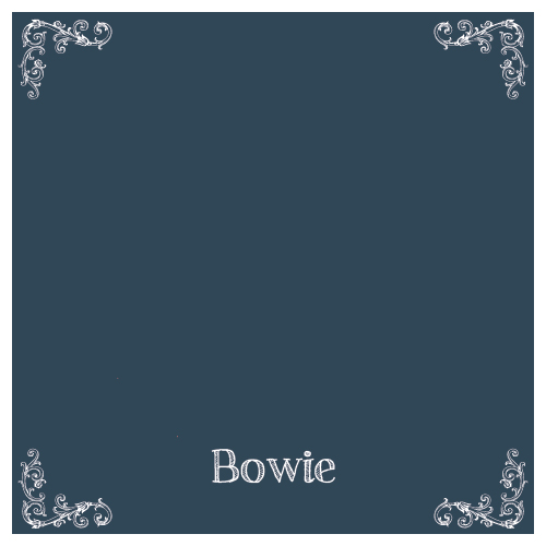
[twocol_one]
A blue unlike any other. This color features deep shades of denim and of emerald green creating a finish that draws the eyes in no matter where it is in the room. A lighter and beautiful compliment to Bowie, another show stopping blue. Black Hemp Oil wax, Umber wax, Black glaze, and White Wash Glaze are a few favorite finishes on this blue that is complimentary to grays and browns alike.
[/twocol_one]
[twocol_one_last]
Creature of the deep sea, an emerald green dark dramatic turquoise. Drenched with emerald and turquoise pigments, complimented by all shades of turquoise but also stands alone as a unique color selection. Pairs with many color palettes. A brave selection that reaps the benefits of adoration. Black Hemp Oil wax, White Wax, and Silver Wax all create unique dimension when used with this shade of abyss.
[/twocol_one_last]
[twocol_one]
Dusty blue inspired by an overcast day. A touch of brightness from cornflower blue and gray to tone down this perfectly shabby pale blue. Black Hemp Oil Wax and Driftwood Glaze are beautiful finishes paired with this color. Limited edition Spring 2016.
[/twocol_one]
[twocol_one_last]
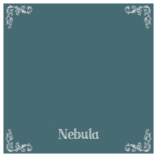
Inspired by nature, this stone blue gray creates harmony with Limestone, Nebula, Smokey Quartz, or Peppercorn. Black Hemp Oil Wax and White Wash Glaze are just a couple of finishes that create dimension with this natural shade.
[/twocol_one_last]
[twocol_one]
One of the most unique shades of slate blue. Green and gray undertones and a touch of warmth make up this shade that speaks of slate stone and natural beauty. To say it has “Jen ne sals quoi” is an understatement since this color is definitely something more than words can describe. Limited Edition Spring 2016
[/twocol_one]
[twocol_one_last]

Deep and dramatic jewel tone purple. If purple had a navy, her name would be amethyst. Grown up beauty revealed in an updated childhood favorite color. Driftwood and silver wax are unexpected finishes that produce a unique elegance to this shade of richness.
[/twocol_one_last]
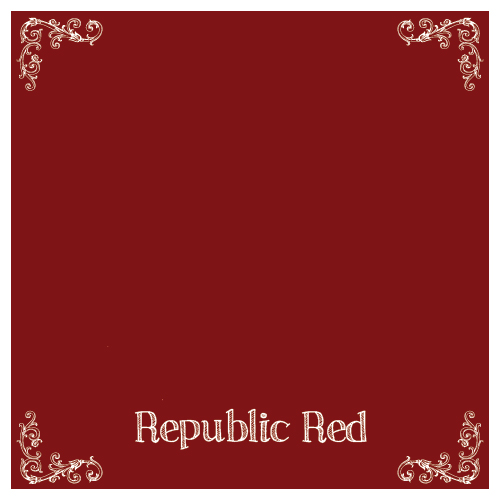
[twocol_one]
Nautical Navy Blue that belongs next to Snow Owl, Limestone, and Gray Linen. Lake house living and rustic finish lovers agree, this blue is timeless and rich. White Wash Glaze and White Wax creates a beachy sea salted feel to this respectable color. Beyond agreeable with Republic Red and Beeswax in addition to many more colors.
[/twocol_one]
[twocol_one_last]
A true show stopping peacock blue. Navy with a slight emerald cast create an unforgettable and one of a kind color. Dramatic and attention demanding, it is a gorgeous accent to whites, Gray Linen, Smokey Quartz, and more. Limited Edition Spring 2016.
[/twocol_one_last]
[twocol_one]
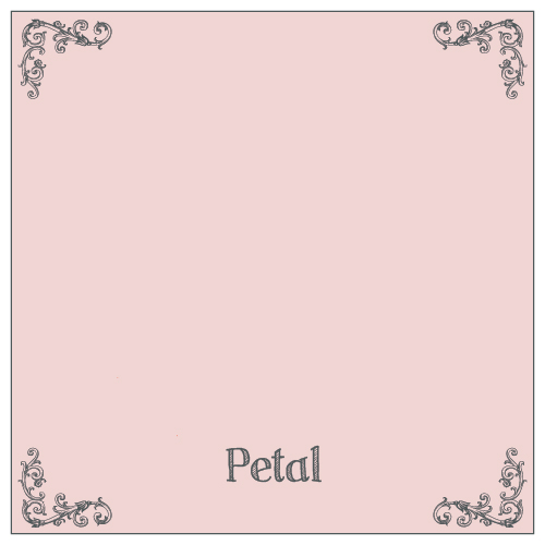
Pale Peony Shabby Chic Pink! This girly shade is a dusty pale spring pink that is timeless and will forever be modern and vintage at the same time. Black Wax adds vintage patina or Gold or Pearl Glaze glamorize this girly favorite.
[/twocol_one]
[twocol_one_last]

Tropically drenched coral pink with dramatic influence. Excellent paired with Deep Turquoise, Mermaid Kiss, or 1950’s green. A modern alternative to pastel pink for little girls and all other lovers of pink!
[/twocol_one_last]
[twocol_one]
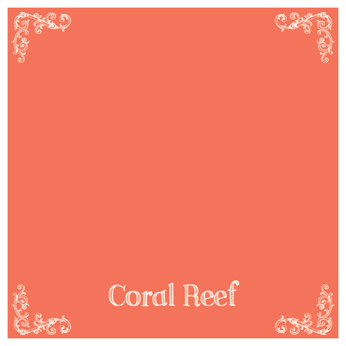
Tropical charm in a rich coral pink with peachy orange beauty. A favorite with Deep Turquoise, Mermaid Kiss, Antique Villa, and many more. Tone down with Black Hemp Oil wax for glam up with Pearl Glaze.
[/twocol_one]
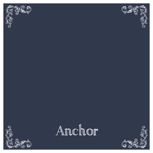
[twocol_one_last]

A captivating Americana red, reminiscent of a faded flag with vintage flair. Complimented by Anchor, Beeswax, and more. Black Walnut glaze adds old barn patina to this shade.
[/twocol_one_last]
[twocol_one]
A cranberry red that was inspired by a vintage Union Jack Flag. Just enough brightness and red pigment to be attention grabbing with a slight vintage cast to it. Black Glaze adds dimension and brings out more of a vintage finish.
[/twocol_one]
[twocol_one_last]
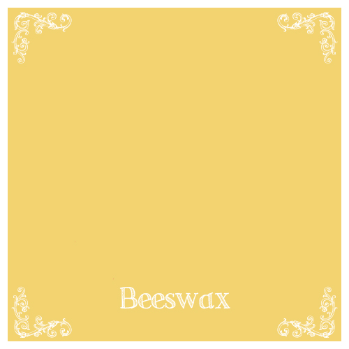
A golden harvest color that is a natural shade of rich yellow, a true representation of beeswax, this color is complimented by reds, grays, and more.
[/twocol_one_last]